In February of this year, my husband and I welcomed Baby Boy #2 into our family:
We moved Baby Boy #1 into his new Big Boy Room on Christmas day (inspiration board and pictures will follow); and then it hit me, I had yet to think about the nursery design. Initially I thought we would simply move the new guy into the old nursery. But...the nesting instinct was strong in me this time around. With only a month left to go, I decided I must update the nursery.
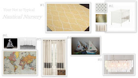
I found a lot of great inspiration for the bedroom around the web (see below). With all of these rooms in mind, I put together this inspiration board:

#1. Rug from Overstock.com
#2. DIY bedding textiles, World Market Pillow, and and IKEA Sundvik crib
#3. West Elm Capiz Chandelier
#4. DIY Nursery Mobile, using paper mache boat pattern found at Ann Wood's blog
#5. Restoration Hardware Canvas Stripe Drape (which I also DIY'ed)
#6. Nursery Art: World Map (PaperSource) and black and white nautical photos.
And here is a sneak peak at the space today:
When planning the room, I found the following inspiration from around the web:
This was my absolute favorite room, designed by interior designer Lindsay Brier for her son, which I found at Project Nursery. I think the light airy feeling was what drew me in at first. I also kept going back to rooms with blue and orange accents. This nursery stood out to me due to the the main elements being neutral; particularly the natural jute rug, grey and white striped walls, and white furniture.
I found this nursery, designed by Heather Cook Elliott for her daughter Wren, at Honey & Fitz. Again, I liked the grey walls but this time the main accent color was yellow. The unique feature that kept me coming back to this room was the black and white photos as a backdrop to the great planet mobile.
I also chose this nursery (source?) because the color on the walls was quite similar to what we already had in the room (my husband was in no hurry to re-paint this room). I really liked the yellow accent with this blue color; this room convinced me to go the route of a yellow accent vs orange. Also, it was really hard to find cool orange elements at the time I was searching!
I will be back later with more on the nursery, as I pull the final accessories together.


I love that photo of your nursery!! You really did a great job of pulling from your inspirations to make a fresh look. Excited to see the rest!
ReplyDeleteThanks so much for the comment! I will be adding more updates on the nursery this week!
DeleteLOVE your nursery sneak peek! I can't wait to see a full reveal!
ReplyDelete