As I near completion on the boys' rooms, I've begun to think about "finishing" other areas of our house. I love spending time in my bedroom at the end of the day to unwind and relax. For that reason, I've focused in on our master bedroom next. I took the following pic with my new iPhone (yes! and why did I wait so long?) this morning, so the quality is kind of eh:
Before I continue with the main point of this post, I feel compelled to note that I really want to post completed pictures of the nursery; however, my time to take pictures is during naps and therein lies the problem. How can I get a good picture of the room while Baby Boy #2 is in the room, napping? Now that it is dark at 5 o'clock, it's also hard to take GOOD pics when their dad is ready to help out. Soon, I will post a nursery tour....
In the meantime, here is another snapshot of the nursery, with a small gallery wall added, taken in poor light, so sorry:
OK, back to the master bedroom. When I think of what I want my master bedroom to feel like, I always write down the same things.
Simple, yet luxurious:
Comfortable:
Romantic:
I want it to be a master retreat. Calming and zen-like after a day of craziness with the little ones. :)
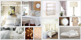
I decided to spend time reviewing the images I've been pinning to look for some common themes among rooms that I am drawn to:
white on white
light and airy
textured pillows and textiles
touches of simple patterns
touches of gold
architectural windows
glass and all things sparkly
With that in mind, I created the following inspiration board:
Here is the room today. It's a place I like to be in, but it is a room that is far from done:
Did you notice the paper blinds? We have been in the house almost four years now and I still have yet to commit to window coverings. I actually have some white panels for this space, but due to the sloped ceiling and relative window height, I'm having a hard time deciding how to hang the panels. More on that later.
Note the antler from my Iowa Trip.
Two of my favorite Goodwill finds from last week are in this picture. I think I spend too much time in that store. Anyway, this bench was $7. I have plans to paint it and make a seat cover, but for now I kind of like the warmth it adds. Not sure if it will stay here, though, because I intended this bench for our back entry until I can afford a more customized built in.
Also, the duvet is from Goodwill. No, it isn't used. Target donates clearance items that do not sell to the Goodwill. I happened to be standing there when a new shipment arrived. This king duvet and shams was $25, but with a 25% discount it was only $19. Yes. This price is great for me since I tend to change my mind on bedding yearly.
Here is one last look at the room from another angle just to give more of an idea of the space and existing furniture I'm working with:
I have plans to update my room using most of the main elements. I just need to give some of these things a refresh. I will be back with more on that later. I also feel compelled to mention that the terrible paint job is the thing I most want to change...glossy paint on a sloped ceiling just doesn't work. :)
I've decided to use my Pinterest inspiration boards to try to help me to elevate this room to the next level. I LOVE pinning, however, sometimes I feel like I get stuck in the "look at all of these beautiful pictures" rather than using those ideas in my own home. How about you? Have you used any Pinterest ideas to date?
Thanks for reading!


Dawn, I think your bedroom space looks so cozy and even though challenging, I love all the angles. I love your inspirations boards! How did you get the pictures to do that??
ReplyDeleteAnyway regarding your shades... Check out Country curtains woven shades, they are perfect for a bedroom because of the pull chain and they add so much texture to a neutral room like you are going for.
My bed is also up against windows and I've had mine for years and love them.
http://www.countrycurtains.com/product/040547309+textured+woven+shade.do?sortby=ourPicks&filterby=
Can't wait to see the finished room!
Hi Luci! Yes, the angled ceilings are a challenge for sure. We would love to add some sort of wood paneling some day. I will check out the shades you mentioned...we need window treatments for our entire house. Thx!
DeleteAs for the inspiration boards, what editing program do you use for your pictures? I use Picasa. For the boards I use the collage function. It is REALLY easy. I found a tutorial here when I wanted to creat a blog header:
http://blissfullydomestic.com/life-bliss/geek-life-bliss/how-to-make-a-blog-header-for-free/66333/
This comment has been removed by the author.
ReplyDeleteWow! that bedroom is so interesting and beautifully done! I love how you created an inspiration board from your pins to see what the common elements were. I'm going to be doing a series on my blog about inspiration boards some time in Jan 2013 and would love to feature this post. Let me know if your game.
ReplyDelete~Lynn